Customer Segmentation using K-Means Clustering
Overview
This project explores how customers can be segmented into meaningful groups using K-Means Clustering. I started this project out of curiosity about how businesses understand their customers to improve marketing strategies.
Problem Statement
The goal was to identify customer segments based on behavior. Such segmentation helps businesses target the right audience, offer personalized experiences, and improve customer retention.
Exploratory Data Analysis
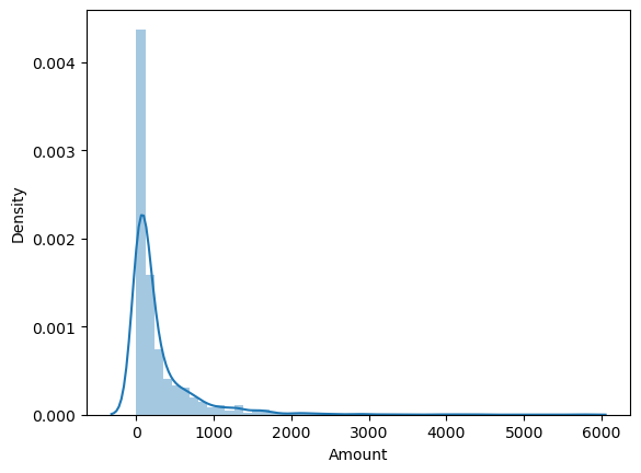
The distribution of transaction amounts shows a strong right skew, indicating a majority of low-value transactions and a few high-value ones which could affect average metrics.
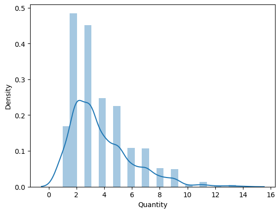
Most purchases are for small quantities, typically 1–3 units. Bulk orders are rare. This reflects common consumer purchasing behavior in retail.
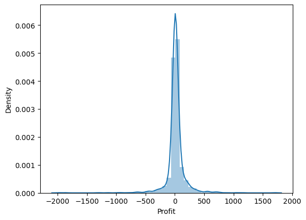
Profit values show many near-zero values. This suggests thin profit margins and the possibility of many low-profit items or frequent discounts.
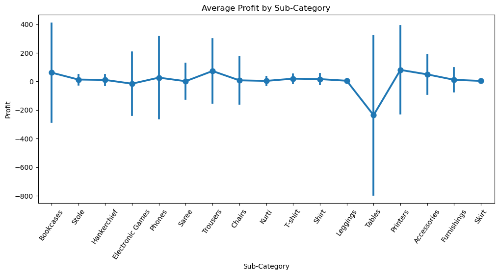
Phones and Chairs show consistently high profits, making them top-performing items. Binders, Tables, and Bookcases display negative or very low average profits, indicating potential loss-making areas or heavy discounting.
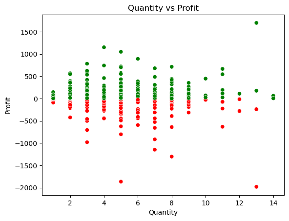
There's no clear linear correlation between quantity and profit. Profitability may decline with larger orders — likely due to volume-based discounts.
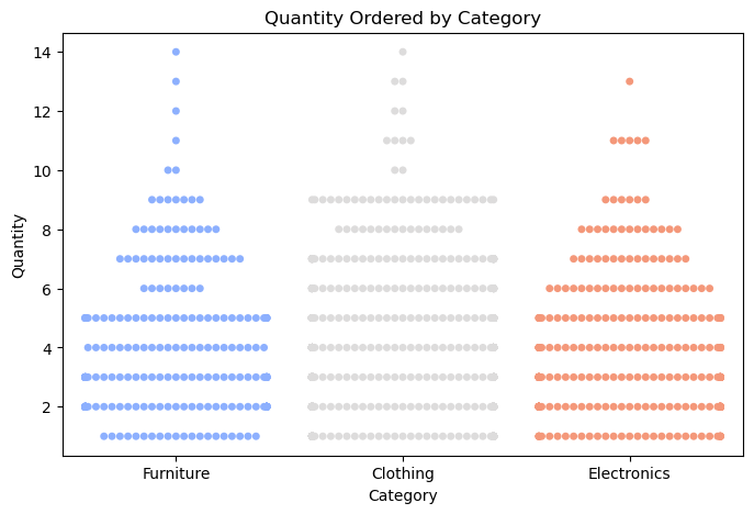
Clothing stands out as a highly profitable category with a wide spread. Furniture shows inconsistent profits, with some losses, suggesting it needs further attention.
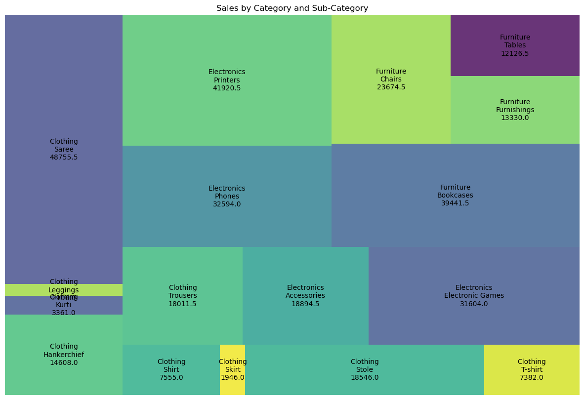
The treemap shows Phones and Chairs as dominant subcategories by sales. It visually identifies top revenue drivers and areas to focus on for marketing.
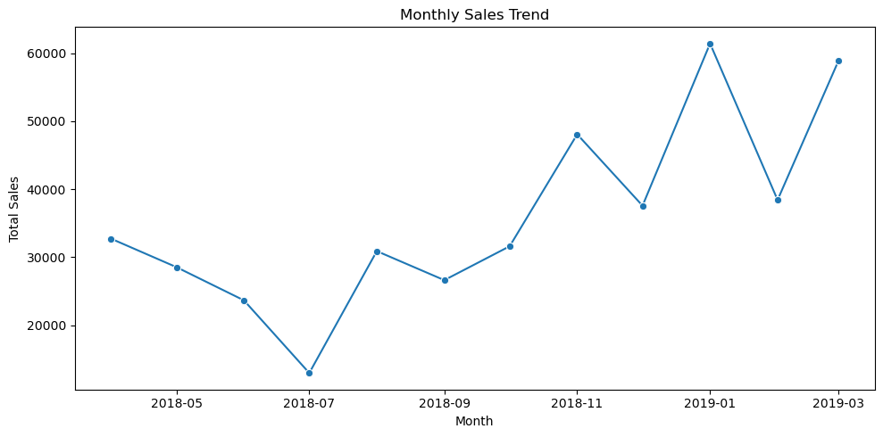
Monthly sales exhibit seasonality with repeating patterns. Peaks during certain months may correspond to sales campaigns, holidays, or budget cycles.
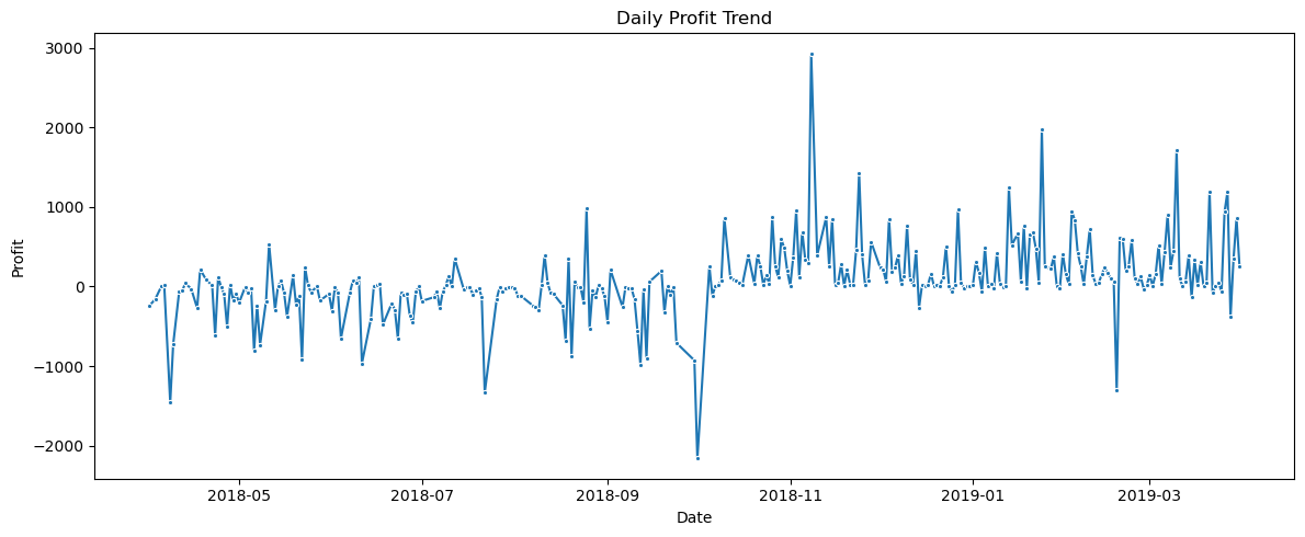
Daily profits show volatility with several negative profit days, indicating returns, discounts, or operational losses. Overall, there's no consistent upward or downward trend.
Clustering Process
After scaling and preprocessing the data, I applied the Elbow Method to determine the optimal number of clusters. KMeans was then used to divide the customers into segments.
Cluster Results

Insights
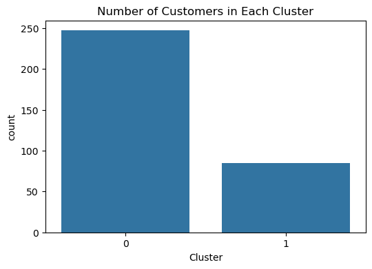
Each cluster represented different customer types. For instance, one group showed high spending — ideal for premium marketing. Another segment had low spending — suitable for budget offerings.
Based on this, targeted marketing efforts weighted toward the higher-spending segment would likely be more profitable than treating all customers uniformly.
My Thoughts
Initially, understanding the correct number of clusters and interpreting them was challenging. Visualizing the clusters helped a lot. I learned how to better preprocess and scale data to get meaningful results.
What I Learned
- Hands-on with KMeans and unsupervised learning techniques.
- Data preprocessing and feature scaling.
- Visualization storytelling using charts and interactivity.
- Importance of choosing the right metrics and methods for real-world applications.
Technologies Used
- Python (Pandas, Matplotlib, Seaborn, Scikit-learn)
- HTML, CSS (for this page)
- Jupyter Notebook